Advanced Field Types
Beyond simple text and checkbox fields, xAssets forms support several advanced field types that provide richer data entry and display capabilities. This page covers drop-down selectors, dot lookup fields, databox containers, form containers (subforms), and the form references tab.
Dot Lookup Fields
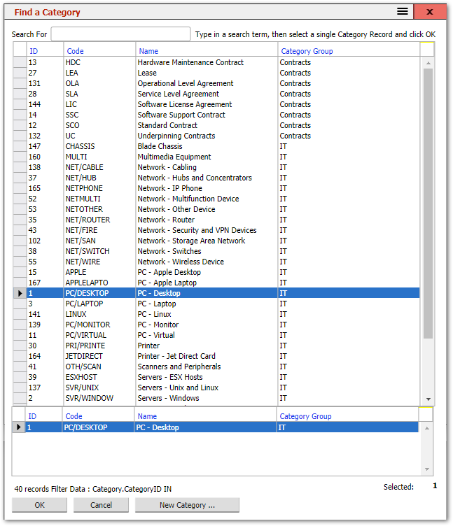
Dot lookup fields are an alternative to dropdowns and provide the user with a Find Dialog to enable them to find the record that they want to insert:

Click on the magnifying glass or field to find a value:
There are 3 types of dot Lookup fields:
- ... Lookup -- the standard dot lookup that enables the user to select a value.
- Read ... Lookup -- A Read-Only dot lookup that displays a value that cannot be changed.
- Locked ... Lookup -- A dot lookup field that works the same as a standard dot lookup, but the user cannot click on the field label to lookup values.
In some cases the user can select multiple values. The instructions next to the Search box tell the user whether a single or multiple values can be entered.
Dot Lookup Properties
- Find Query: This is the Query to use for the Find Dialog. This is only required for custom fields or cases where the Find is different from the default, such as where a subset of possible records is to be shown to the user. Only Queries in the FIND Query Type will be available here. Find Queries should have a %SearchFor% parameter in their filter so that they can be searched in the Find Dialog. They should also contain the value to be inserted into the field as a column, even if hidden.
- The

- Dialog Title: This is the title for the Find dialog.
- Record Type Title: This is the name for the type of records that the user is selecting if not the default name for the subject. For example: if a dot lookup expects Assets, but only of a certain type, such as Laptops, then the Record Type Title may be "Laptops".
- Initial Search: By Default, a dot lookup will show all records in the search results, specified with the wildcard %. Changing this value will present the results of that initial search in the Find dialog.
- Select Mode: Single or Multiple. By default, this will be Single. Note: only a field that can have multiple values should be set to Multiple.
- Pass Through Parameters: This is a list of the parameters to pass through to the Find Query, if required.
Drop Downs (Select Fields)
These present the user with options from which to select a value in a drop-down selector field:

When the field is clicked on, the drop-down is initiated and provides the user with a list of options and, if the list is longer than 10 entries, a search box to type a value in so that the options available is restricted to values that match the typed text.
In most cases, a dot lookup can be used in place of a dropdown. This is advisable in cases where there are a lot of options to choose from as this can make the dropdown field slow to render on the form.
A standard dropdown displays the Field Label as a hyperlink to a lookup for that field which enables the user to view add and delete entries in the source table.
There are 3 types of dropdown fields that can be selected:
- Dropdown -- The standard dropdown field
- Read Dropdown -- A read only dropdown field that shows a value that cannot be changed.
- Locked Dropdown -- A dropdown that is like the standard dropdown, but the user is not able to click on the Field Label to access a lookup list of options.
Dropdowns can also be configured to display with multiple rows and can also be set so that the user can add options not already in the list.
Dropdown Properties
- Lookup Query: This is the query to use for creating the dropdown list if not the default lookup for this field. Lookup Queries are of the Type LOOKUP. These queries have 2 or 3 columns. The first column contains the value to be placed into the field. The second contains the text to be shown in the dropdown. The third optionally contains a group name so that options can be grouped. In this case, the Group column should also be used as a Sort column on the query.
- The

- Hide Null Value: By default, a dropdown will allow the user to choose no value (or Null value) unless the Validation specifies that the field is mandatory. If Hide NULL Value is checked, then the empty value will not be available. Advanced users can replace a null value using options in the Querystring.
- Select mode: Single or Multiple. By default, this will be Single. Note: only a field that can have multiple values should be set to Multiple.
- User Can Add options: If set, then a user will be able to add options to those already in the dropdown. To do this, the user will type in the value for the option and then click on the typed text to select it. Note: this does not add the value into the source data, it only puts the value into the field. It should only be used in cases where the value and text for the dropdown are the same.
- Rows: a Numeric value that indicates how many rows of options from the dropdown should be visible in the field at once. If there are more options than the number of rows, a scrollbar will allow the user to search through the options. A Search box will not be available if there are more than 1 rows.
Form Container (Subforms)
A Form Container field enables a sub form to be displayed in the form in the position of this field. The properties of the Form Container are:
- Form: The name of the Form to use as the SubForm. Note: this is referenced by the form name. If the subform name is changed, the system will not be able to find the form to display it unless this value is changed. The

- Form Layout: This can be either Default or Editor. Editor forms bind values to a data source and allow the user to edit the values.
- Columns: The number of columns of fields that the subform contains.
- Display Name Widths: the widths of the field labels on the subform. This is overridden by any specific field width values on the subform fields.
- Optional: If checked, then the system will not give an error if the form cannot be found.
- Datasource: This is the name of source for the data on the form. In most cases, subforms will inherit data from their parent form, and so the data source should be specified as %inherit%
Databox for Queries and Trees
A databox is a container where a Query or tree is to be displayed on the form. The Databox properties are:
- Query: The name of the query to be shown in this databox.
- Presentation: Table or Tree -- determines whether the query is displayed as a query or a tree.
- No Data Message: The message to display in the Query results if there is no data to show.
- Select mode: By default, it is possible to select more than one record in a query using Ctrl and Shift whilst selecting them. If this property is set to Single, then only one record can be selected at a time. Any attempt to select another record will deselect the previously selected record.
Form References
The References tab in the Form Editor shows all other forms, queries, and transformations that are connected to the current form -- either referencing it or referenced by it. This is useful for understanding the impact of changes before you make them.
- Click a Name to open and edit the referenced form, query, or transformation.
- Click a Referenced By entry to edit the specific field that creates the reference.
Check this tab before deleting or renaming a form to ensure you do not break other parts of the system.
Related Articles
- Forms Overview — Introduction to forms and the form editor
- Editing a Form Field's Properties — Setting properties on individual form fields
- Managing Form Fields — Adding, removing, and arranging fields on a form
- Specification Data — Creating custom data fields
- Form Layout HTML and StyleSheets — Customising form appearance with HTML and CSS