Editing a Form Field’s Properties
This page describes the properties available when editing a field on a form. Each property controls an aspect of how the field looks, behaves, or connects to the database.
Opening the Field Properties Dialog
To edit a field’s properties:
- Open the form in the Form Editor.
- Click the Form Fields tab (see Managing Form Fields).
- Click the field name link in the list, or select the field and click

The field properties dialog opens:
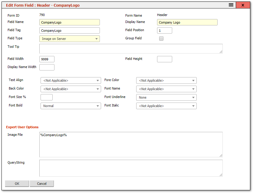
Note: The properties shown depend on the field type. Some properties only appear for certain types (e.g., dropdown-specific properties appear only for dropdown fields). See Advanced Field Types for type-specific properties.
Common Field Properties
Data Binding
| Property | Description |
|---|---|
| Field Name | The database column this field reads from and writes to. Automatically set when a field is inserted from the available fields list. If you change the Field Name on an existing field, the system creates a second field on save and the original remains -- this is a useful technique for cloning a field on the same form. |
| Display Name | The label shown next to the field on the form. This is what the end user sees. It does not need to match the Field Name. |
| Field Tag | An internal identifier. Read-only -- do not change this value. |
Layout
| Property | Description |
|---|---|
| Field Position | A numeric value that determines the field’s order relative to other fields on the form. Lower numbers appear first. |
| Field Type | Controls how the field is rendered (text box, dropdown, checkbox, dot lookup, etc.). The system suggests a type when a field is first inserted. Changing the type is possible but may cause data display or entry issues if the new type is incompatible with the data. |
| Group Field | When checked, this field is placed immediately adjacent to the previous or next field (if they also have Group Field checked) in the same row. Useful for placing small, related fields side by side -- for example, a city and postcode pair. Only applies to automatic layout (not custom HTML layout). |
| Field Width | Width of the field input area in pixels. A value of 9999 tells the system to make the field as wide as the available space. |
| Field Height | Height of the field in pixels. Most fields do not need this. Set it for multi-line text areas or other fields that benefit from a taller display. |
| Display Name Width | Width of the field label in pixels. Overrides the form-level label width for this specific field. Leave blank to use the form’s default. |
Behaviour
| Property | Description |
|---|---|
| Validation | Controls the input requirements for the field. Options include: no validation, mandatory (user cannot save without entering a value), numeric only, date format, and others depending on the field type. |
| Default Value | The value pre-filled in the field when a new record is created and the field is empty. Only applies to fields that support defaults. |
Appearance
| Property | Description |
|---|---|
| Text Align | Horizontal alignment of the field content: Left (default), Centre, or Right. |
| Fore Color | Text colour for the field. Accepts any valid HTML colour value (e.g., #FF0000, red). |
| Back Color | Background colour for the field. Accepts any valid HTML colour value. |
| Font Name | The font family for the field. Use standard web-safe fonts: Arial, Verdana, Tahoma, etc. |
| Font Size % | Font size as a percentage of the default. 100% is the standard size. |
| Font Underline | Enables underline, overline, or strikethrough on the field text. |
| Font Bold | Renders the field text in bold. |
| Font Italic | Renders the field text in italics. |
Advanced
| Property | Description |
|---|---|
| Querystring | Available to expert users. Accepts additional parameters in querystring format to control advanced field behaviour. |
Tips
Tip: The most commonly changed properties are Display Name (to rename a field label), Field Width (to resize a field), and Validation (to make a field mandatory). For most fields, the other properties can be left at their defaults.
Warning: Changing the Field Type of an existing field can cause problems if the new type is incompatible with the data stored in the database column. For example, changing a text field to a dropdown will work, but changing a date field to a checkbox will not display dates correctly.
Tip: To make a group of small fields appear side by side (e.g., City, State, Postcode), check the Group Field option on each of them. The system will render them adjacently in one row.
Properties for Specific Field Types
For properties that appear only on certain field types (dropdowns, dot lookups, form containers, databoxes), see Advanced Field Types.
Related Articles
- Managing Form Fields — adding, reordering, and resizing fields
- Advanced Field Types — dropdowns, dot lookups, subforms, and databoxes
- Editing a Form — the Form Editor header fields