Dashboard Layout
This page explains how the grid-based layout system for dashboards works, including rows, columns, and how menu categories map to cells in the grid.
The Dashboard Grid
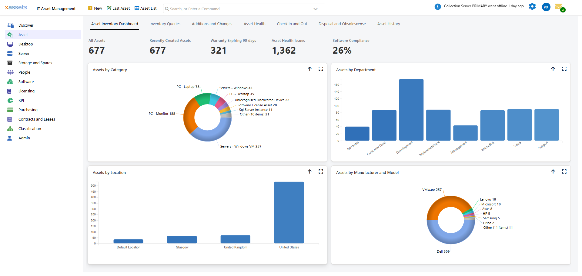
A dashboard is organised into a grid of rows and columns. The grid can have one to four columns across the page. Each cell in the grid is populated by a menu category, and the menu items within that category determine what appears in the cell (links, charts, or data tables).
How Cells Are Sized
- By default, columns share the available width equally (e.g., two columns each take 50% of the width).
- A cell can span the full width of the page if it is the only cell in its row. This is common for wide queries or charts.
- The height of each cell is determined automatically by its content.
In the example above, the second row contains a single menu category ("Discover Dashboard 4") that spans the full width because the query it contains is wider than a single column.
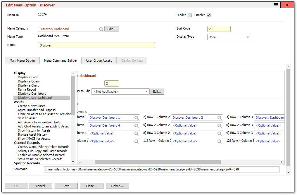
Configuring the Grid Layout
The grid layout is defined in the Menu Command Builder for the menu item that invokes the dashboard. Each row-and-column position is assigned a menu category:
Steps to Modify a Dashboard Layout
- Find the menu item that invokes the dashboard. You can Ctrl-Shift-click the dashboard title to open its menu item directly.
- Open the Menu Command Builder tab.
- The builder shows the grid with row and column assignments. Each position has a dropdown to select a menu category.
- To add a row, assign a menu category to the next available row position.
- To add a column, assign additional menu categories to column positions within the same row.
- To remove a cell, clear the menu category assignment for that row-column position.
- Click Save.
- Refresh the page to see the updated layout.
What Goes in Each Cell
Each cell corresponds to a menu category. The items within that menu category control what appears:
| Menu Items in the Category | Result in the Cell |
|---|---|
| Multiple items with Display Type "Menu" | A vertical list of clickable links |
| Multiple items with Display Type "Horizontal Menu" | A horizontal row of links |
| One item with Display Type "Query or Chart" | A query table or chart rendered directly |
| One item with Display Type "Query with Help Text" | A chart/table with descriptive text above it |
| A mix of display types | Links appear first, followed by charts/tables |
Tips
Tip: Start with a simple layout (two columns, two rows) and add complexity as needed. It is easier to add cells than to reorganise a complex grid.
Tip: To see which menu categories are assigned to a dashboard's cells, Ctrl-Shift-click the dashboard title to open the menu item, then view the Menu Command Builder tab.
Warning: If a menu category assigned to a dashboard cell contains no enabled menu items, the cell appears empty. Remove unused cells or add content to keep the dashboard clean.
Related Articles
- Creating a Dashboard — building a new dashboard from scratch
- Dashboards Overview — what dashboards are and how they are built
- Menu Command Builder — the tool used to configure the grid layout
- Menu Categories — the containers that populate each cell